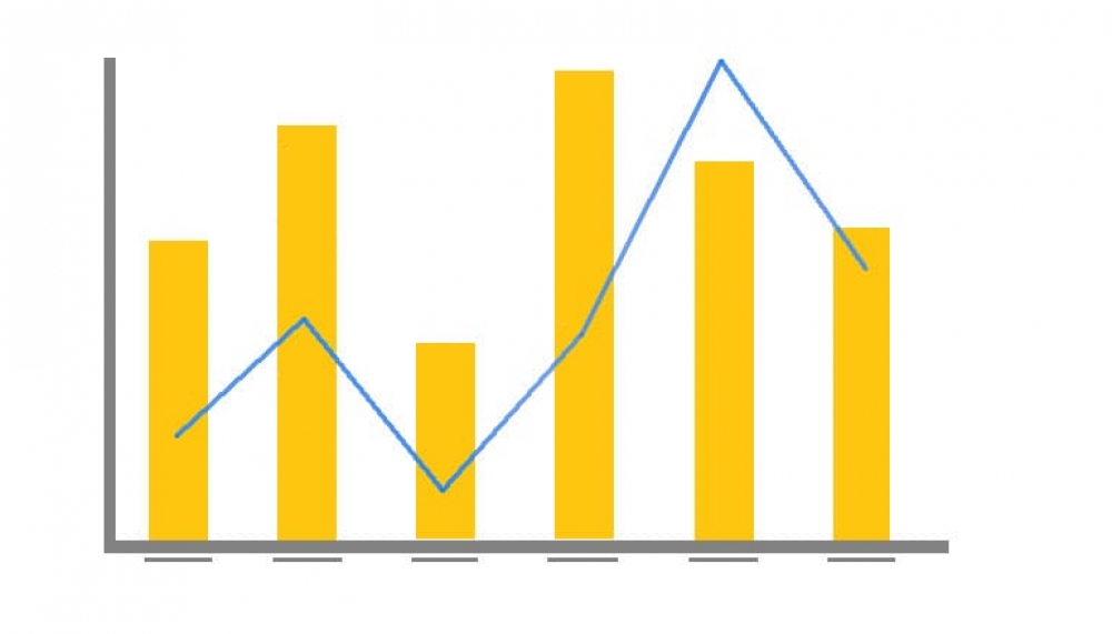
Sometimes it’s necessary to plot two or more sets of values on a single chart. However, if the scales of the measures are different the smaller measure might get lost.
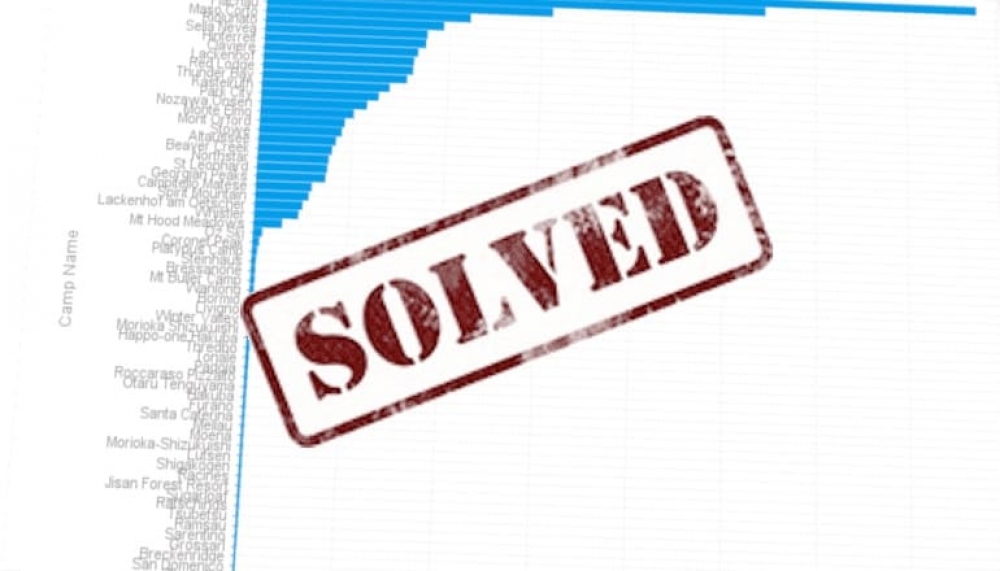
Ever wanted to display your data in a chart but found that there were just too many categories? The good news is that Yellowfin introduced new functionality that can solve this headache.
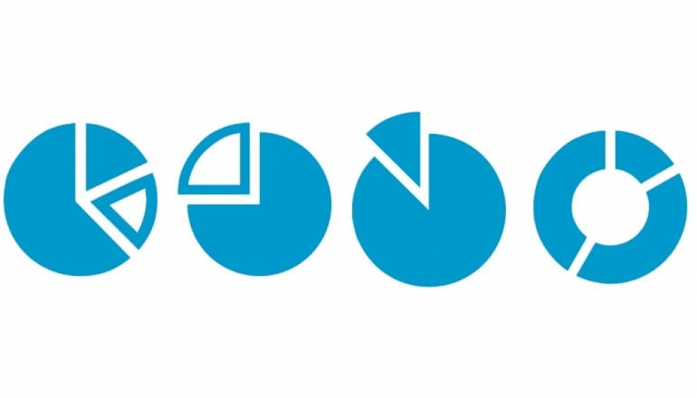
We use charts to show information in a visual manner that enhances the interpretation and analysis of data. Using charts or graphs takes away the complexity of the data and emphasize the message that we are trying to convey.
Most systems administrators will tell you that creating user accounts is not the most exciting task to do! It is repetitive and time consuming – even when using Yellowfin! Fortunately, there is a way to make this task less mundane.
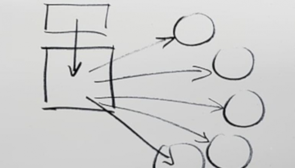
Last week I was trying to get the Drill Through relationships to work in a line chart. The horizontal axis for the line chart was set to a date field and the vertical axis to a metric. How hard can this be??
Most users will use the Drag and Drop report creation method to build their reports. This is the default builder, taking the complexity of the database out of the equation.